Eztrackr is a SaaS job application tracking platform for web and mobile that helps job seekers stay organized and improve interview outcomes.
Context
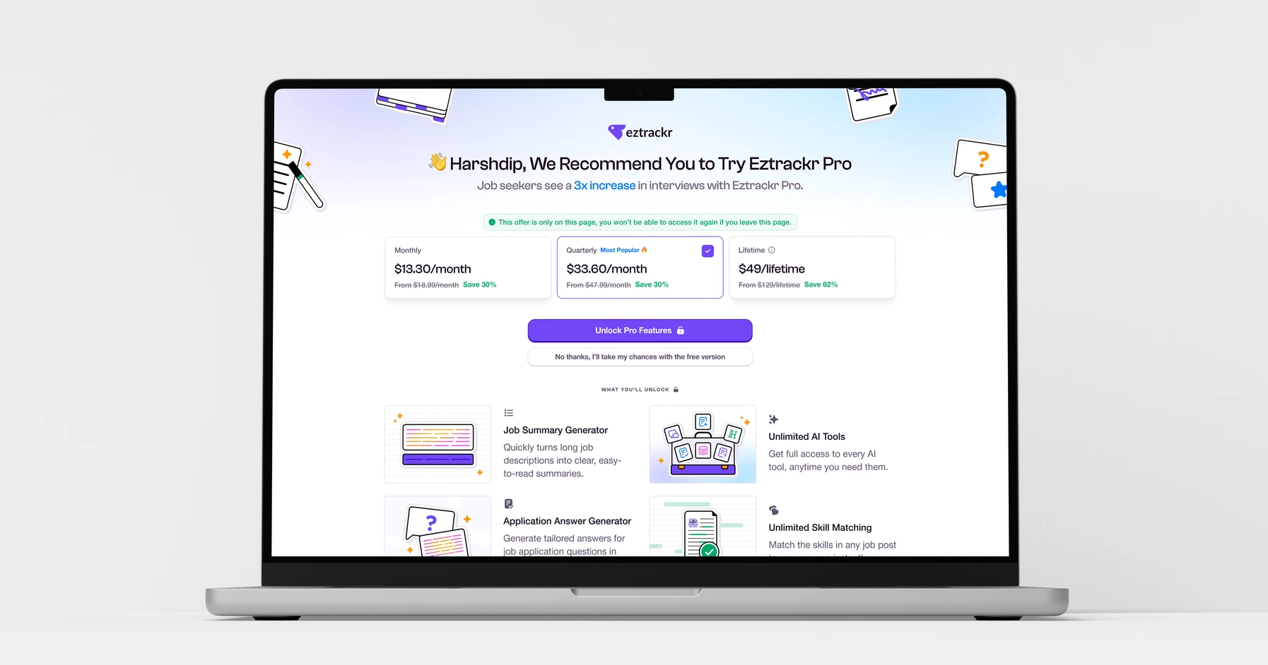
The Pro upgrade page played a key role in communicating the value of Eztrackr’s paid features, but the original experience relied heavily on text, making it difficult for users to quickly understand what they would unlock.
My task was to redesign the page with visual elements and UI cues that clearly communicate how Pro features work, helping users better understand the product’s value before upgrading.
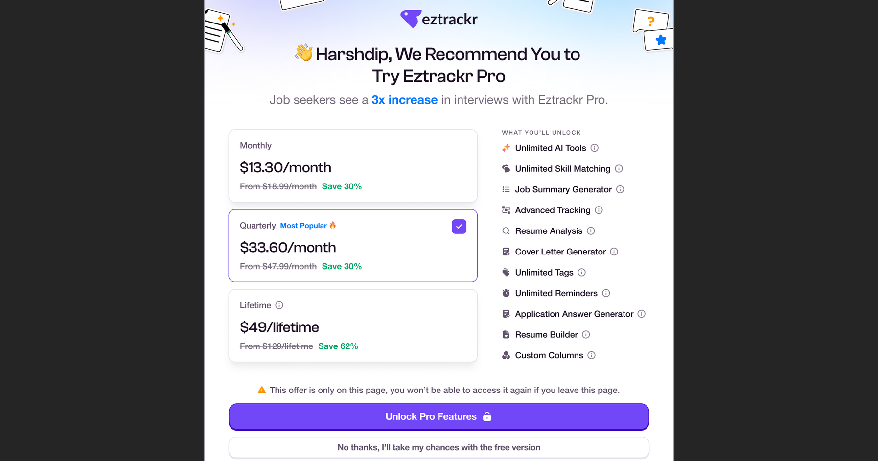
Initial Pro Feature Page
Design Challenge & Solution
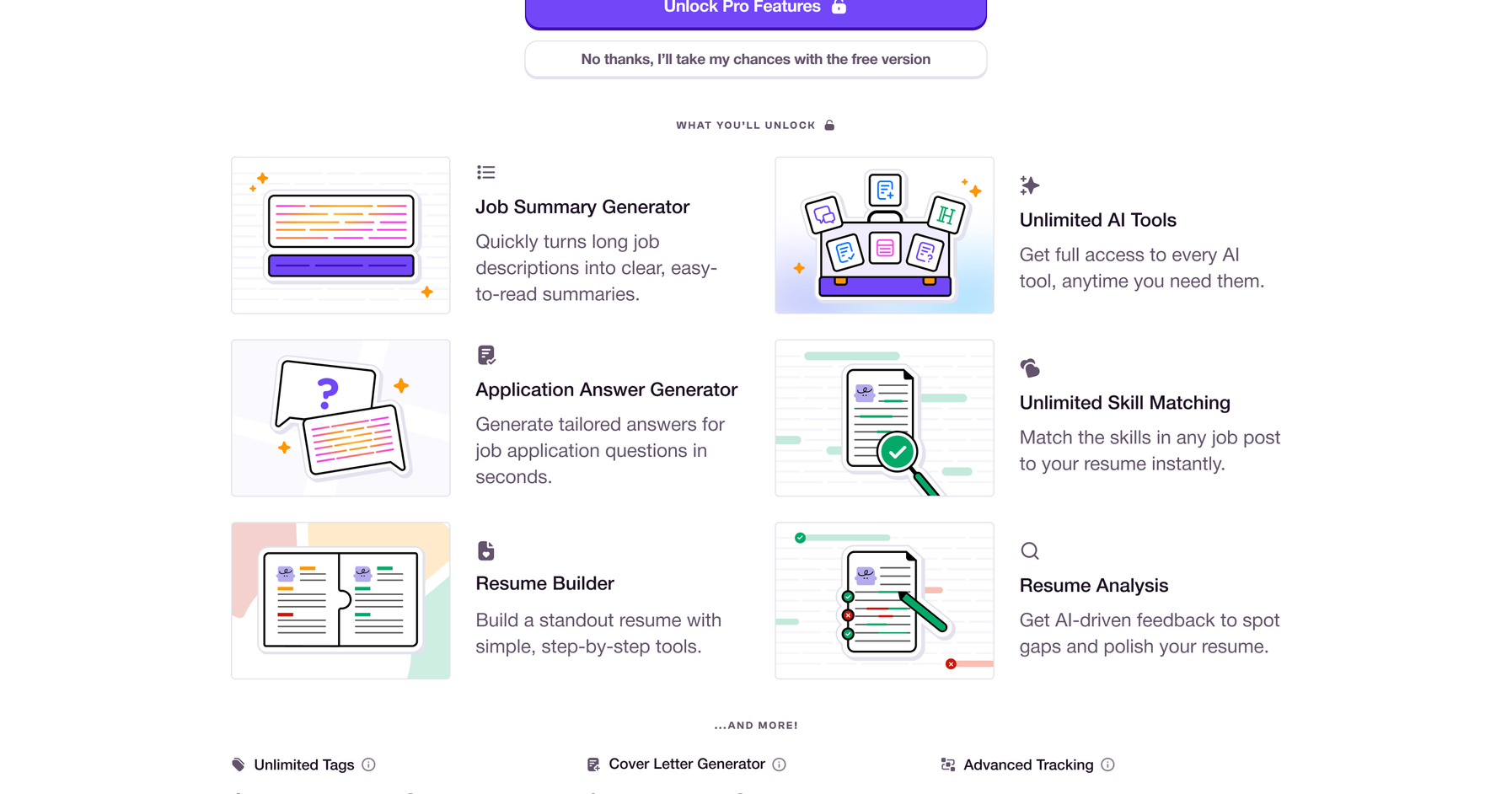
The main challenge was improving feature clarity. Since the Pro page relied on illustrations instead of real product screenshots, each visual needed to clearly communicate how a feature worked. Early feedback revealed that some illustrations felt too abstract, making it difficult for users to quickly understand their value.
The page was refined with clearer visual cues, stronger labeling, and closer alignment between illustrations and feature descriptions. The redesigned experience prioritized feature clarity by introducing visuals that explain how Pro features work, replacing the previously text-heavy layout.
Key tools are surfaced before the upgrade prompt, allowing users to quickly understand what they would unlock with Pro and making the upgrade decision more informed.
Product Design Team:
Dante Cardines - Head Designer
Ysa Alvarez - Senior Product Designer
Yuko Mitsuhashi - Junior Product Designer
Design Contributions:
Illustration and Visual Design
Layout Refinement